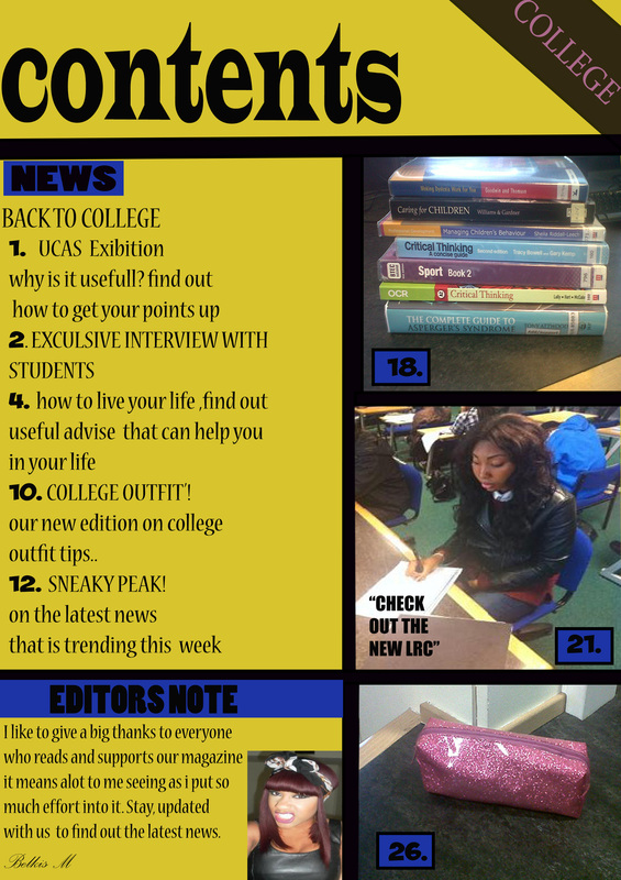
I wanted my contents page to follow the theme colour of my front cover. The colours used was blue, yellow and black. I was a bit confused on how i should structure my page so i looked at other contents pages for inspiration. Seeing as it was my first time using Photoshop, I made sure i used guidelines to help me position things and to make it more accurate. The black lines on the page that separates the different pictures and writing from each other was used to make the page look more interesting, without it the page would look dull. Using a dull yellow in the background was a good idea, seeing as the black writing shows clearly against it. Page numbers are vital in a magazine so that the reader knows, what page articles are on. When it came to positioning the pictures it was a bit of a struggle because i had to crop them several times and re-sized them to make it fit in a certain section. Another problem I faced was making sure the picture didn't look to wide or stretched out.
To conclude I think the contents page was tricky at first but during the process of making it, my skill were improving. I'm happy with my final out come but one problem I would have improved is that there's too many gaps on the page.
To conclude I think the contents page was tricky at first but during the process of making it, my skill were improving. I'm happy with my final out come but one problem I would have improved is that there's too many gaps on the page.