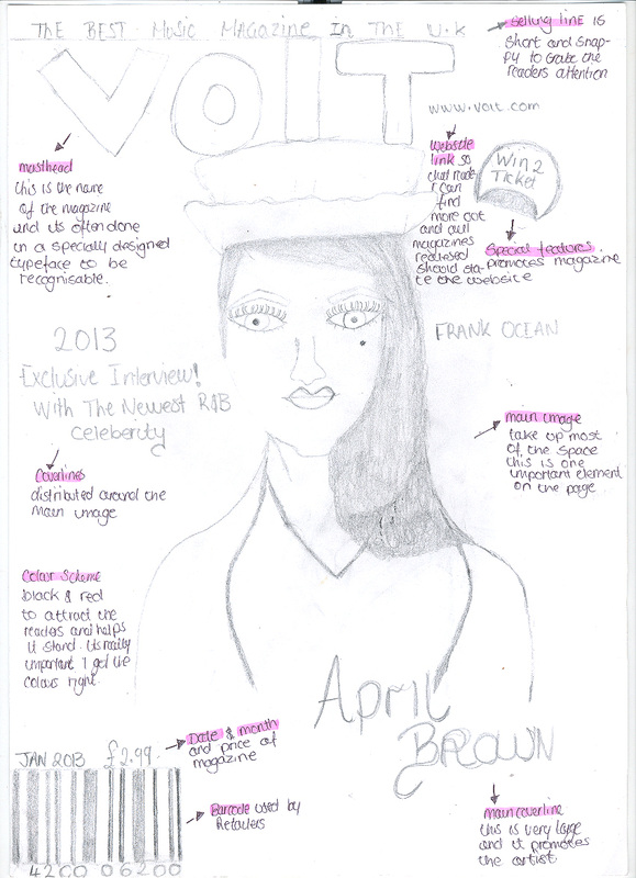
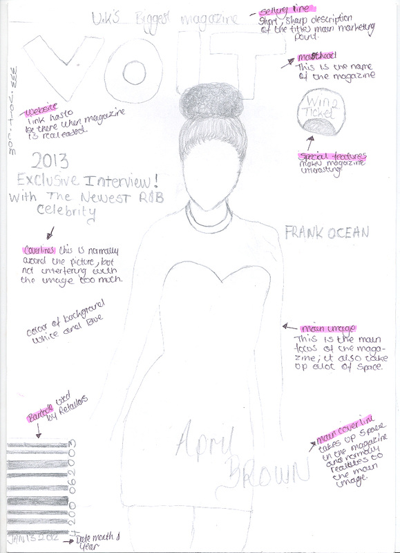
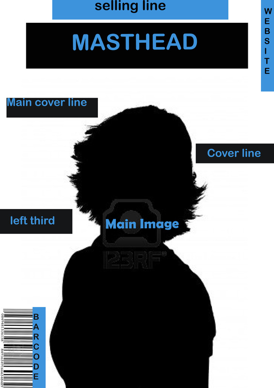
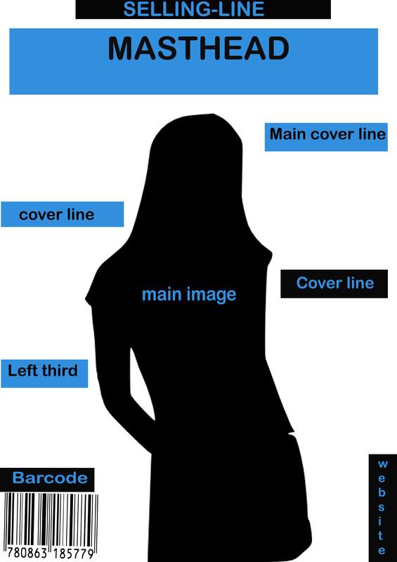
Front Cover music Magazine Draft
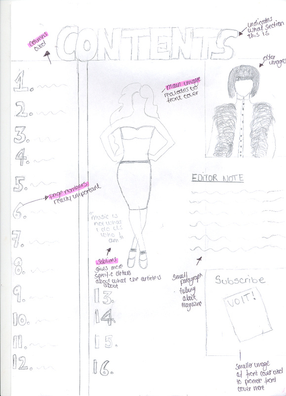
Contents Page Music Magazine Drafts
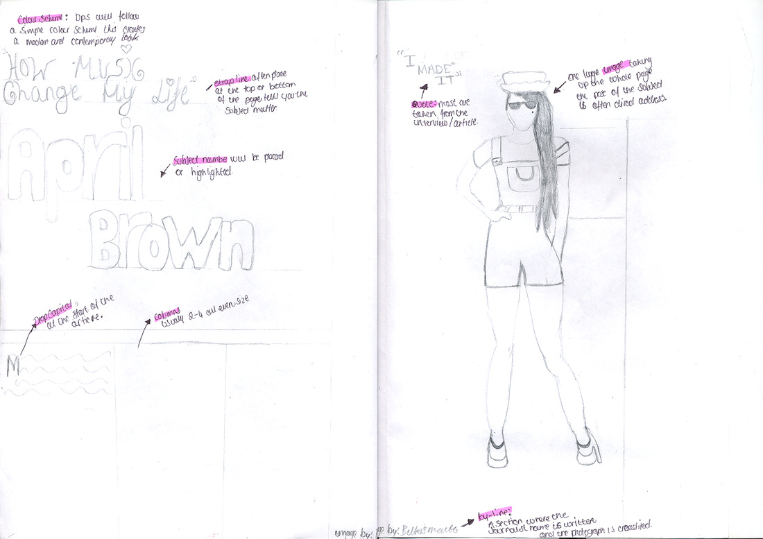
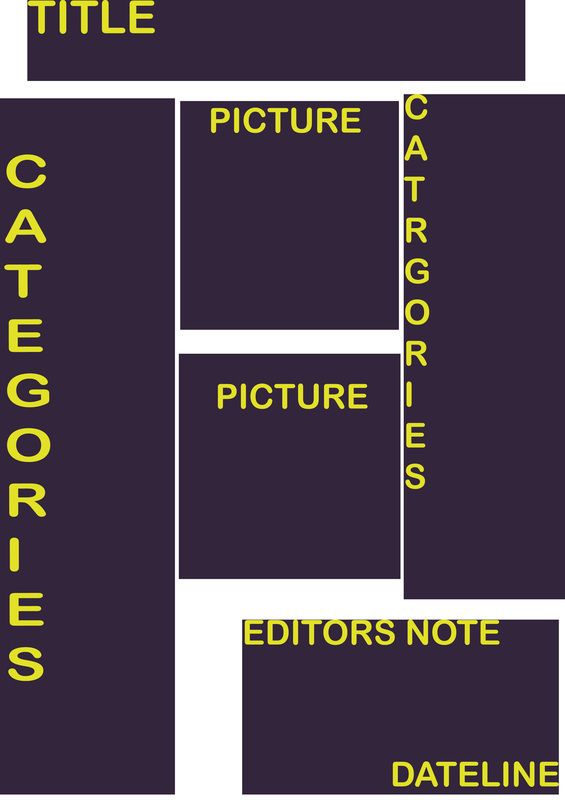
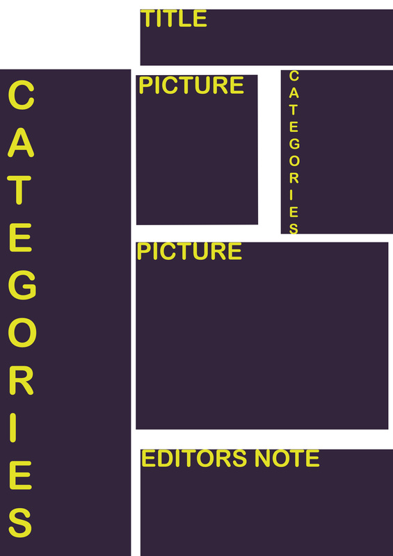
Double Page Music Magazine Drafts
Drawn Drafts
In this slideshow i drew two front covers, two contents pages and one double page spread. In my front covers I annotated the convention I have used. I've used different camera shot angles for my main image to make them look different in both front covers .Also the coverlines are surrounding the main image . one problem with my front covers is that I could have changed the layout of it and positioned the conventions in different ways.
With the contents page I really like the fact that I used a verity of layouts so this made it much easier for me when picking my designs I also annotated. I made sure I mixed up all the convention in order to make them look different in both contents pages. However,I think i could have added more images in the first contents page seeing as their just one long shot image
Lastly, with the double page spread I only drew one layout of it, but i still annotated it and used convention that were iconic to other music magazines.One problem, is that i should have drew more double page spreads.
I furthered developed my designs using Photoshop
|
|
|

|
|
Templates Drafts
I furthered developed my designs by using photoshop. I like both of the front covers, due to the fact that it looks simple.This is because I never put too much coverlines around the main image because i new people tend to look at images more than writing. one problem I made is that both front covers look similar to each other, but i prefer the 2nd one better even though their not much of a difference the camera shot angle appeals to me more than the first one
I developed the 2nd contents page that I drew this is because I like the use of columns and it makes it stand out more, using more than one image in the contents pages makes it look more interesting. However I prefer the 2nd Photoshop draft because I like how it has a mixture of a big image and small image rather than the first 1 that has two small images.
When developing my double page spread designs on Photoshop I changed it up a bit and done an extra draft making two seeing as i only did one drawing before. furthermore, I like both double pages seeing as they look simple and different from each other, but I like the 2nd draft better because the 'subject name' is arranged better in a straight line rather than the first one that's going diagonal. Also, I prefer the quote being on a separate page rather than interfering with the columns like the first draft.
|
|
|
|


|
